

Case Study: Product Turnaround After 3 Agencies Failed—The Constraints-Driven Playbook
How systematic product discovery with limited resources beat well-funded attempts—a blueprint for building or fixing digital products when constraints force you to understand what actually matters.

Hey everyone👋,
I got something that might be very valuable for you.
This is a case study of one of my favorite projects, and it can serve as a blueprint when you’re building a digital product from scratch or trying to fix one that’s broken.
Most case studies are short, punchy, and designed to sell. They skip the messy parts. I don’t like that approach because it provides almost no practical value. If you want to actually learn something, you need to see the process, not just the polished results.
So that’s what this is.
My core strength, and one of my consulting focuses, is helping founders understand the underlying principles of human behavior driving their product’s growth. Because you can’t reach full potential if you don’t understand the WHY behind what’s working or failing.
This project is a good example of that approach in action, although it is a process of how to do a proper Product Discovery, to ensure you don’t build something people don’t want.
I have seen it way too many times. Do this before writing the first code, and your chance of success will rise incredibly.
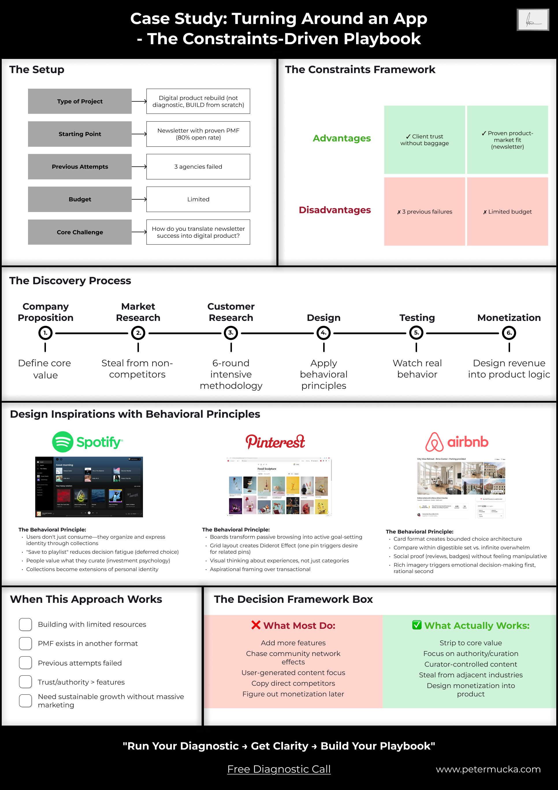
Project Background
The client was two women running one of LA’s most successful newsletters for place recommendations with raving fans and a great community. They had strong brand partnerships with Netflix, Warner Brothers, and other major companies. The newsletter recommended places and events to visit each week, and it crushed—80%+ open rates, which is extremely high.
They wanted their own digital product. Made sense; they had the audience, they had the traction. But after working with 3 different agencies over a couple of years, the product still wasn’t working. They’d built something like Google Maps with social features. People saw potential, but it constantly had technical issues and lacked a clear product vision.
This project had constraints I knew would force clarity. And I believed only I could execute it properly given those constraints. Simply because, for some reason, I cared a lot for this project and its success (which is not good many times haha)
Let’s start with why constraints matter.
Constraints are the Opportunities
For most of my life, I believed constraints were bad. Limited budget, tight timelines, client inexperience—these felt like obstacles to doing good work.
I’ve come to realize the opposite is true. Constraints are what make products successful.
Startups with unlimited money or ambitions to be “everything for everyone” rarely create anything unique. If that approach worked, every corporation would be spinning out successful startups like a production line. But they’re not.
Constraints force clarity. They force prioritization. They force you to understand what actually matters.

Here’s how the constraints on this project shaped the entire approach:
🟢 Advantage #1: Client Trust Without Technical Baggage
The situation: Very nice, open-minded clients with no technical or product background.
Why this mattered: Open-mindedness meant I could experiment and get creative without the “we already tried that” resistance you get from experienced product people. But it also meant there was no safety net—I needed to actually know what I was doing because no product, technical, or legal help was coming from their side.
The implication: Visual, transparent, and open communication became critical. I couldn’t rely on shared product vocabulary. Everything needed to be shown, not just explained.
🟢 Advantage #2: Proven Product-Market Fit (Just Not Digital)
The situation: They’d built one of the most successful newsletters in LA for recommending places, with 80%+ open rates.
Why this mattered: Product-market fit clearly existed. Something they were doing resonated deeply with their audience. I just needed to figure out what that something was.
The implication: This changed the entire discovery approach. Instead of broad product exploration, I could go into investigative mode—study what was already working and translate those principles into a digital experience.

This is what I love to do the most.
🔴 Challenge #1: Three Failed Attempts Before Me
The situation: Three other agencies had already tried and failed to make this work.
Why this mattered: In a perfect world, previous agencies would have done proper discovery and left documentation showing what didn’t work. They hadn’t. Some agencies don’t do proper visualization, and others don’t give clients access to materials—essentially holding them hostage.
What I learned: I analyzed the existing app deeply with my team. We understood which hypotheses had already been tested and failed—like the “Google Maps with social features” approach or heavy engagement mechanics. People didn’t want that.
The implication: I had proof of what NOT to build, which saved time and money.
🔴 Challenge #2: Limited Budget
The situation: Not enough money for extensive development, ongoing iterations, or expensive growth tactics.
Why this mattered: This is what everyone hates, but everyone faces at the beginning. I see it as an opportunity to think about sustainability from day one.
The implication: We needed to create monetization approaches that wouldn’t destroy usage or require additional development. This meant the client could earn money immediately after launch without getting stuck with a product they couldn’t afford to maintain.
This is one of the biggest reasons digital products fail. They either give everything to an agency to develop and then run out of money, or they watch too many startup founder videos telling them to “figure out monetization later” or “just find funding.”
All of this can be avoided with a mindset for sustainability and creativity. Limited funds force you to think about more creative approaches.
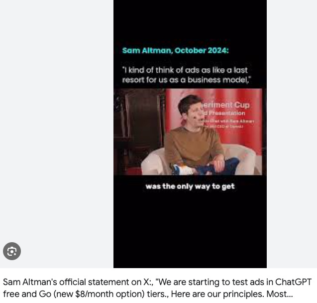
And at the end, you can always go full Sam Altman and raise $7 trillion if your monetization plan doesn’t work out.
Now let’s build the product.
Product Discovery
This is the part that very few want to do or to pay for. But those are generally who build something great.
Most of wants to skip it or rush through it as fast as possible.
But it’s also the part that would save you 10x more money down the line when you inevitably need to fix features that were built on wrong assumptions.
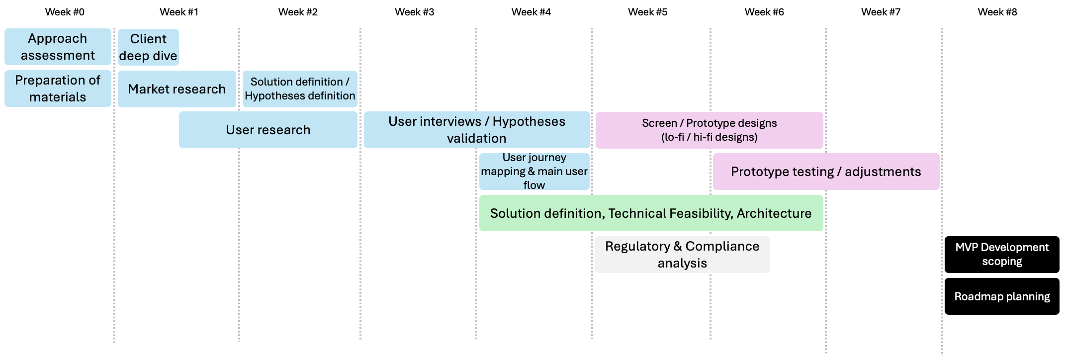
This is a general timeline to follow, that I have also written in my article: How to Build a Startup, Product, or Innovation
Company Proposition
The first thing you should do is map out the company proposition. This can be a workshop with the client, your team, or even yourself if you’re solo.
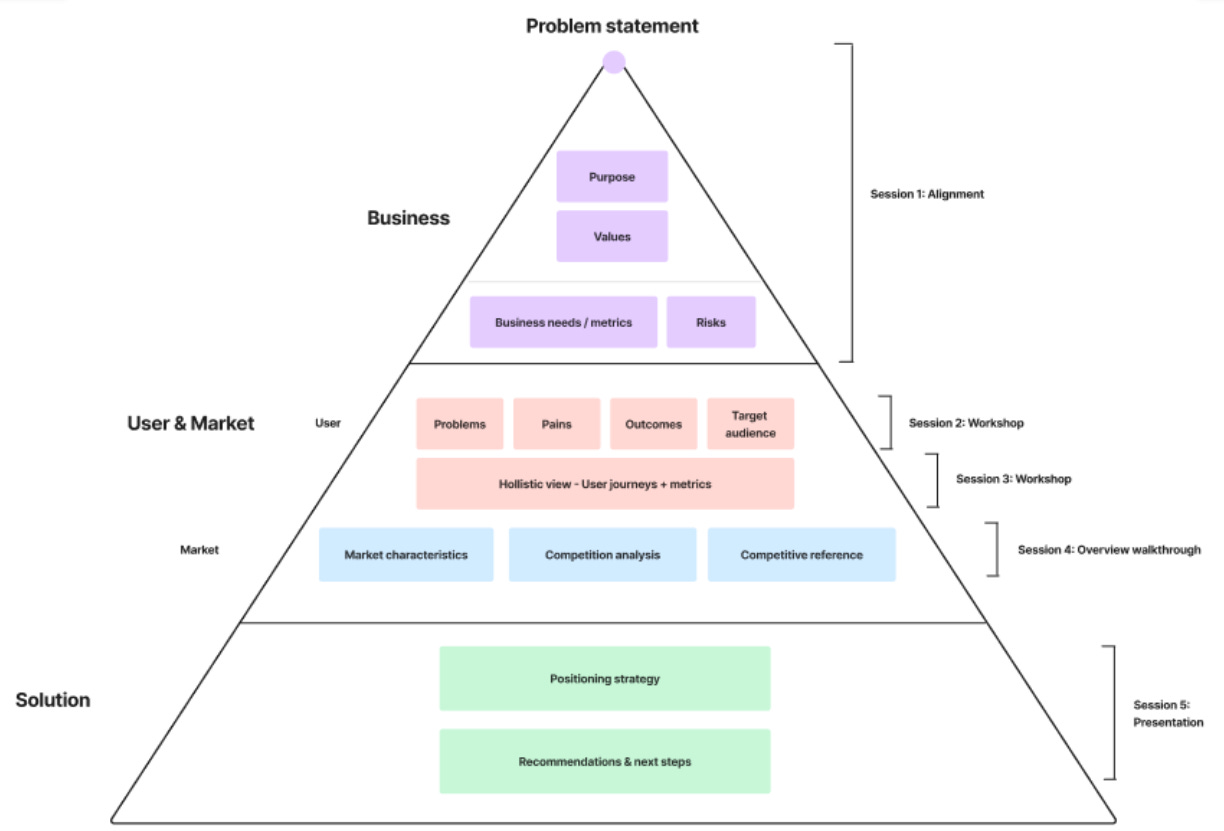
Here’s what I created for this project:
This becomes the source material for everything else—every feature decision, every design choice, every piece of communication. If something doesn’t connect back to this proposition, it probably shouldn’t exist in the product.
The key elements we defined:
Core Value: Curated, trusted recommendations for places and events in LA from someone with proven taste (the 80% open rate newsletter).
Target Users:
Primary: Newsletter subscribers who already trust the founder’s curation
Secondary: LA locals looking for quality recommendations
Tertiary: Visitors to LA wanting insider knowledge
Key Differentiator: Authority and curation quality, not community volume or social features.
This last point became critical later. Most recommendation apps try to win through network effects—more users means more recommendations, which means more value. But that wasn’t the play here. The value came from ONE trusted curator, not from crowd-sourced opinions.
Understanding this upfront shaped the entire product strategy.
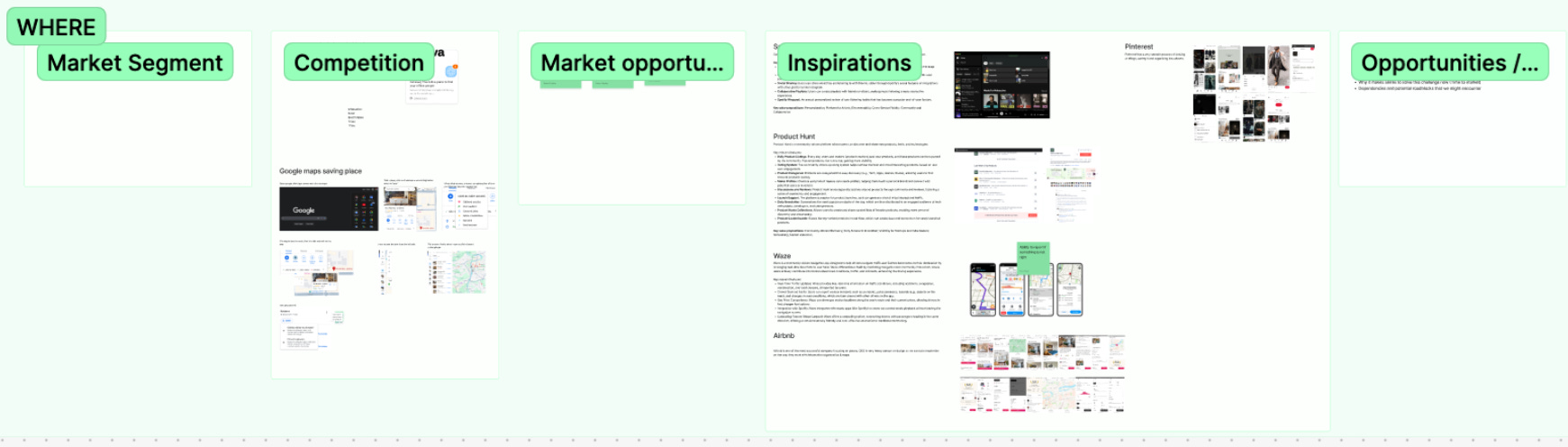
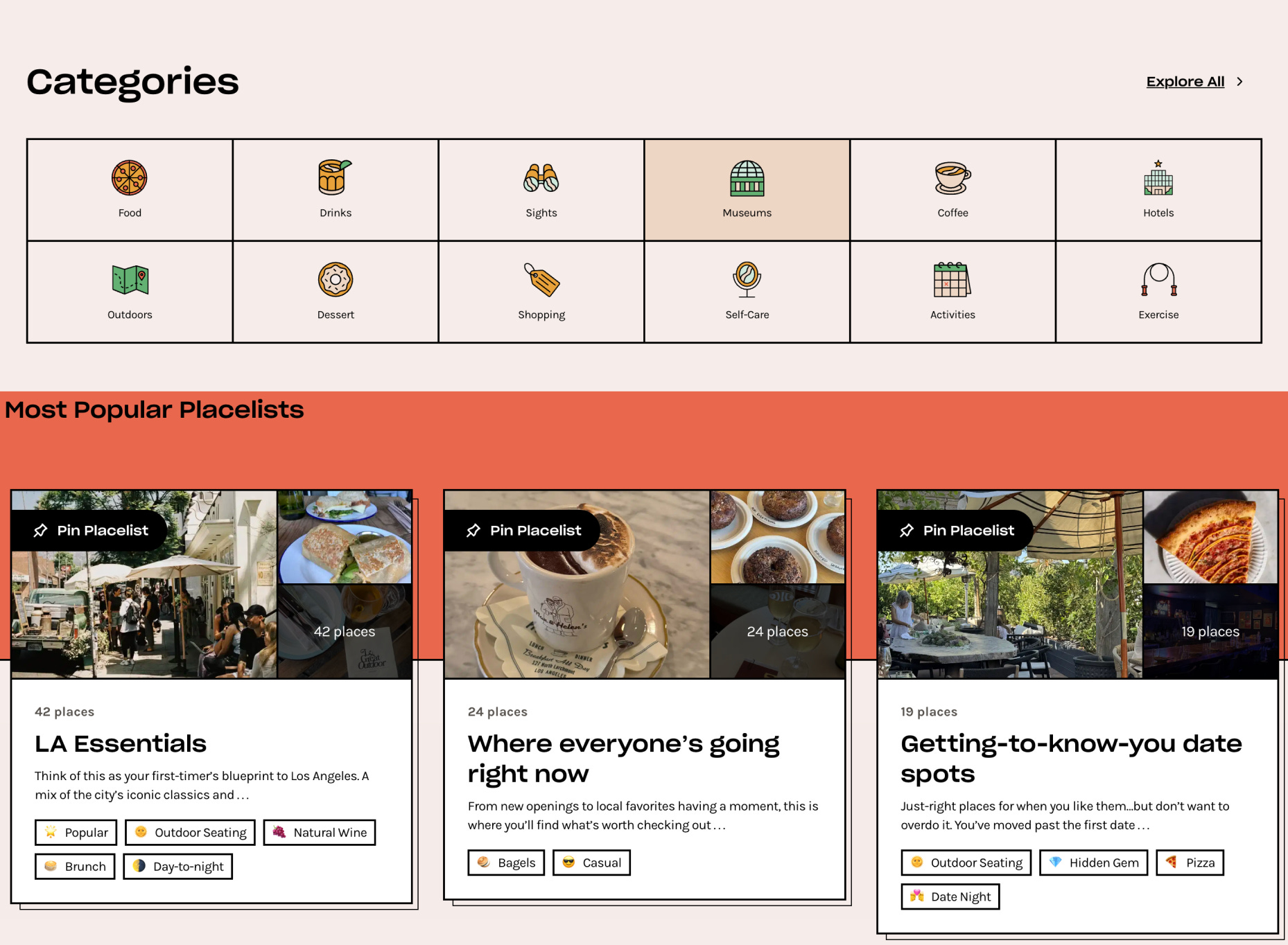
Market Research
I use market research for two main purposes:
1. General Understanding of the Market
This gives me an understanding of who the players are, their positioning, and all other necessary information.
The structure I typically use:
Description
Market segment
Target audience
Value proposition
Strengths
Weaknesses
Pricing models
Visuals
In reality, this is how I executed it for this project:
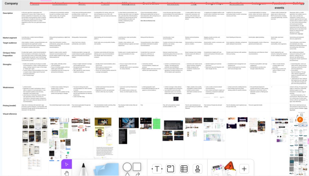
The depth varies depending on the project. Sometimes it’s a couple of sentences per competitor, sometimes it’s very detailed. For this project, I went moderately deep because I needed to understand the competitive landscape but didn’t need to reinvent the wheel.
Visual references are very important for me since I’m a visual person and can be inspired by design patterns and UX flows. I don’t have to reinvent the wheel—I can look at someone who’s done the journey, see what’s working, and make it better.
2. Feature Inspiration and Behavioral Patterns
This is where most people stop at surface-level competitor analysis. I go deeper.
I look for features or interaction patterns I can either copy directly or break down to understand the underlying behavioral principle.
For example, one interesting app I studied had a model where you pay monthly and each week you get a random text message suggesting a dinner spot and a party venue with unknown people you could meet. You could reply to accept or decline.
The surface feature: random social dining.
The underlying principle: removing decision paralysis through constrained choice + manufactured serendipity + social proof through commitment.
That’s what I’m looking for—the WHY behind features, not just the WHAT.
How to Steal Like an Artist (Systematically)
But here’s what very few people do: look for inspiration in products that are NOT direct competitors.
When you have a tight timeline and budget, you can’t afford to build everything from scratch. You need to intelligently borrow proven patterns from adjacent industries.
For this project, I looked at Spotify, Pinterest, and Airbnb. None are recommendation apps for local places. But all three solve similar behavioral problems around discovery, curation, and decision-making.
I’ll show you exactly how I applied these later in the Design section. But the key insight here is that innovation often comes from combining patterns from different contexts, not from pure originality.
As the book Steal Like an Artist says: good artists copy, great artists steal. I was planning to “steal” from the best.
Customer Research
This is simultaneously my favorite and least favorite part of the process.
Favorite because it gives you a unique edge and massive insights that competitors never bother to gather. Least favorite because it’s exhausting work that often makes me want to quit halfway through.
But there’s nothing more important than talking to actual users.
Methodology
When starting proper customer research, I always think about which methods make the most sense given the resources, product stage, and impact potential.
This is the table I generally use:
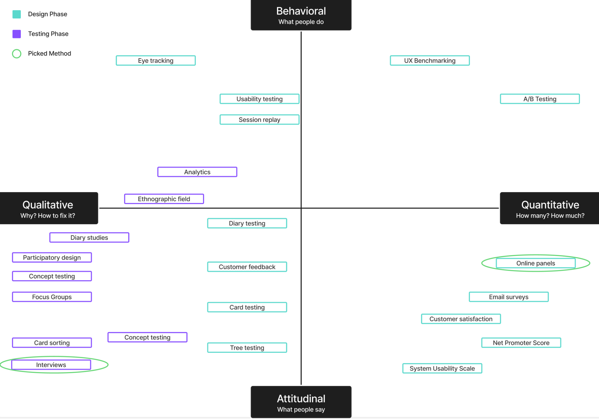
For this project, the most appropriate methods were qualitative interviews with multiple rounds, followed by surveys. This is generally the cheapest approach and works best at the beginning, especially since the client had an engaged newsletter audience.
General Approach
Once I had the methods figured out, I outlined the approach and created a visual for the client showing all the important links and steps.
Here’s what I decided:
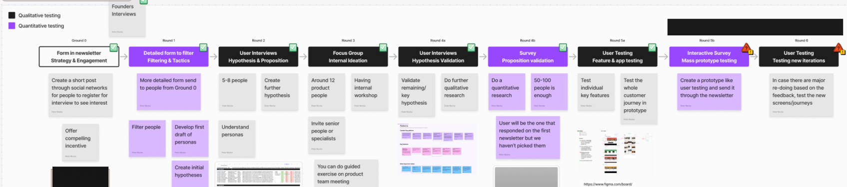
The User Research Strategy:
Round 0 - Form in Newsletter (Strategy & Engagement): Create a short post through social networks for people to register for interviews, gauge initial interest.
Round 1 - Detailed Form to Filter (Filtering & Tactics): Send more detailed form to people from Round 0 to narrow down participants.
Round 2 - User Interviews (Hypothesis & Proposition): Conduct interviews with 5-8 people to create further hypotheses [Qualitative].
Round 3 - Focus Group (Internal Ideation): Run internal workshop with around 12 product people [Qualitative].
Round 4a - User Interviews (Hypothesis Validation): Validate remaining key hypotheses through user interviews [Qualitative].
Round 4b - Survey (Proposition Validation): Do further qualitative research followed by quantitative research with 50-100 people [Quantitative].
Round 5a - User Testing (Feature & App Testing): Test individual key features and the whole customer journey in prototype [Qualitative].
Round 5b - Interactive Survey (Mass Prototype Testing): Create a prototype-like user testing experience and distribute through the newsletter [Quantitative].
Round 6 - User Testing (Testing New Iterations): In case there are major re-designs based on feedback, test the new screens/journeys [Qualitative].
This was probably the most extensive user research in a short period I’ve ever done. No one else at the agency had done anything this comprehensive.
But I could justify it because we didn’t need to spend time defining user personas, doing general research, or getting to know different markets. This was more of an investigation of an existing product with a known audience, which allowed me to go deep rather than broad.
It always depends on the stage of the product.
AI Tool Research
Now, only after I create a general strategy with actual human beings do I look at how AI tools could make the process better.
I have a list of around 35 AI user research tools that looks like this:
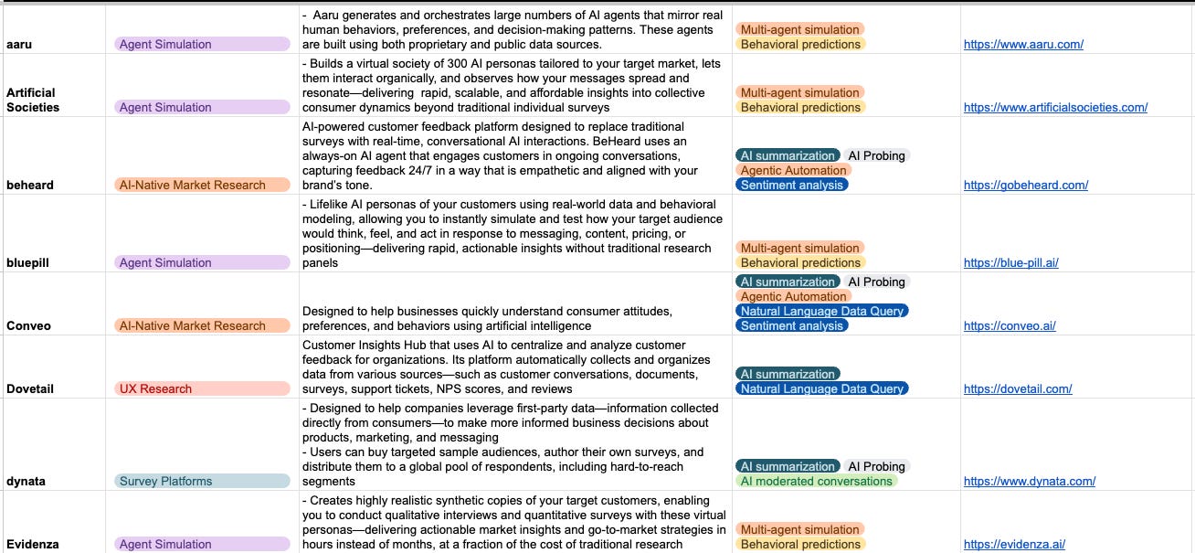
However, people will do anything—try any tool, any shortcut—except talk to their real customers or users. That’s one of the reasons more and more products look like vibe-coded shit that everyone stops using after a while, or they’re only good for personal use.
There are two fundamental problems with relying on AI for user research:
Even the best AI tools claim around 80% accuracy compared to real users. General tools have around 65%.
AI is not creative and will give you the most generic information about users you can possibly get. Even at 100% accuracy, it wouldn’t be sufficient.
So you get 80% accuracy of the most common things ever. You never find out the dark motivations, hidden needs, fears, or triggers. Why people really do what they do, not just what they say they do.
Every time I listen to interviews, I start to get a sense of what people are not telling me, or what they’re lying to themselves about.
I don’t know how many times a similar scenario has happened where people weren’t telling the truth. It’s not that they’re lying per se—it’s that when you put them in a place where they have to imagine themselves in the future, they always over-exaggerate or think of themselves as better than they actually are.
Example: My friend recently wanted to open a Padel place outside the capital city we live in. He asked many people if they would go there, and they said probably yes if it was interesting. Overall, they were excited.
So he was happy. But as I usually do, I had to crash his positive outlook with reality.
I told him to ask again, but in a way where you can observe their behavior and decisions indirectly. Ask them what activities they like to do, what types of things in general, and then either name places outside the center or ask if they travel to do those things.
Almost no one goes outside the center, even for things they really like to do. And if they go, it’s very infrequently. But after they realized this, they mentioned he reminded them and they should start going…….yeah, right.
We are strange creatures after all.
What I use AI tools for:
Initial research on topics
General understanding of people so I can better prepare for interviews
Summarization of interviews
Second opinion on biases when creating interview questions or surveys
AI is not for the complete replacement of your work. And even if it could be, it’s only useful for large companies with hundreds of target groups, validated products, and a need to speed up their work.
Qualitative Research
Now, qualitative research and interview preparation aren’t simple, and there are plenty of materials out there on how to do it properly.
Even doing it yourself without deep knowledge is better than nothing because it brings you closer to understanding customer minds.
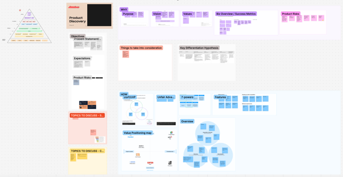
However, I want to show you something I sometimes do as a result of working with the data and insights. This is how I visualize it:
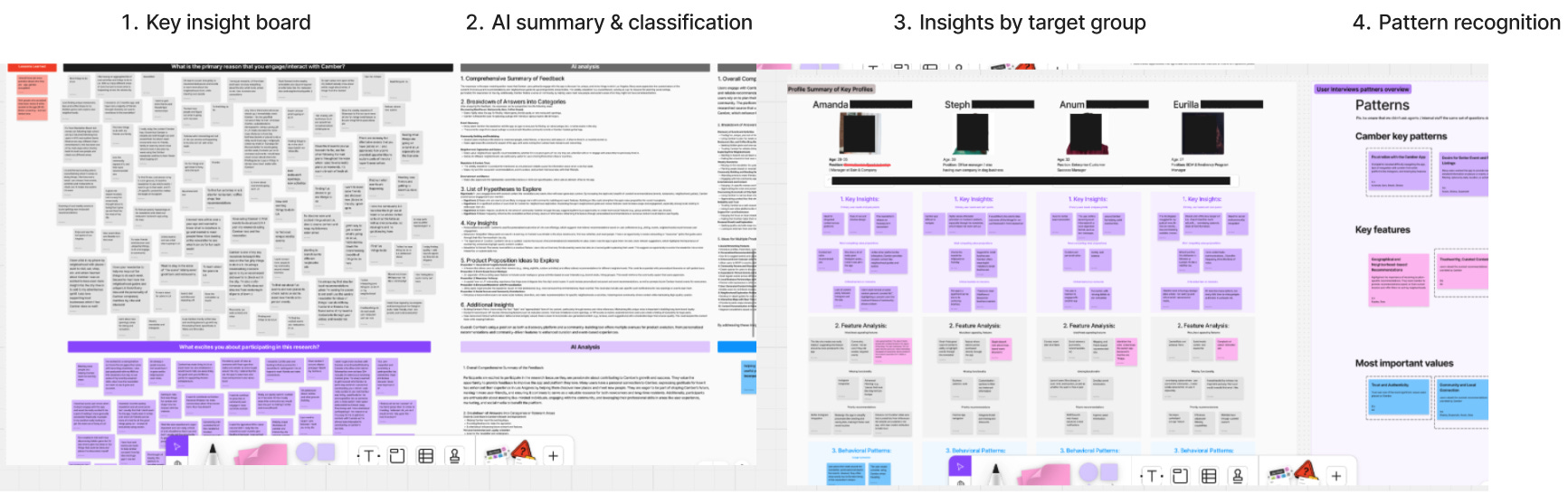
Qualitative Research Workflow:
1. Key Insight Board: Organized all raw interview data and feedback into a visual board (FigJam/Miro), grouping insights by themes and questions. Created purple synthesis cards at the bottom, capturing initial patterns about pain points.
2. AI Summary & Classification: Used AI to process and structure the raw data into:
Comprehensive summary of feedback
Breakdown of answers into categories
List of questions to explore
Product properties ideas to explore
Additional insights
3. Insights by Target Group: Created individual profiles for key participants that best represent each target group (Steph, Arun, Euriba, etc.), showing:
Profile summary
Key insights specific to each person
Feature analysis relevant to their needs
Behavioral patterns unique to their segment
and much more, depending on relevancy
4. Pattern Recognition: Synthesized cross-participant findings into:
Combined key patterns (purple cards showing recurring themes)
Key features (pink cards highlighting must-have functionality)
Most important values (blue cards capturing core user values and priorities)
Added the number of times patterns were mentioned and by whom
Sometimes this level of visualization is unnecessary work. But I’m a very visual person who’s good at seeing patterns, so this helps me think clearly.
Quantitative Research
Same as with qualitative research, there are many methodologies for how to do surveys and quantitative analysis properly.
But here’s what was a game-changer for me.
We already had a proposition of what to build. I thought I had a pretty clear idea—focusing on social features like seeing recommendations from other people, ability to add places you’ve visited, seeing comments and lists from the community.
We got responses from almost 360 people, which is incredible for this type of project or early-stage product. Getting that many people is almost impossible, and most agencies are happy with 40+.
I want to be transparent here and show you the key questions that made me completely rethink the proposition. This is why it’s so important to ask the right questions.
Key Realization #1: The Features Nobody Wanted
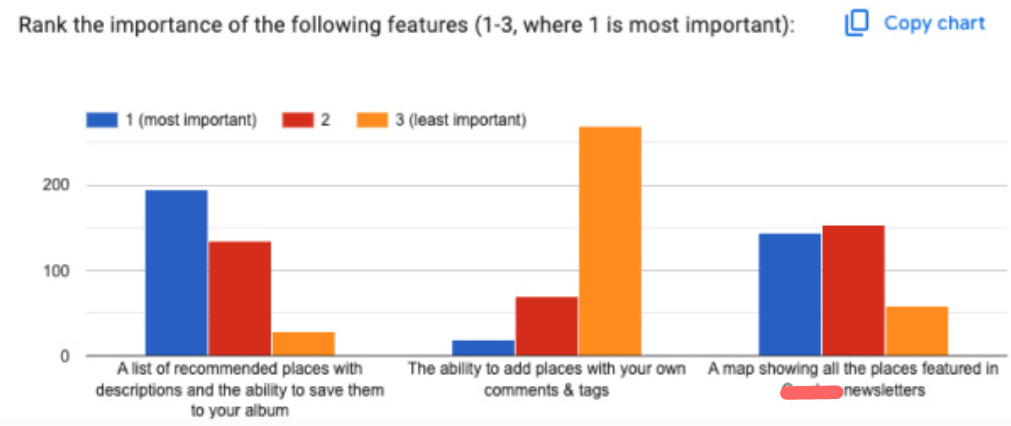
I discovered that one of the main pillars—easy adding of places on their own or through various integrations—was completely useless. People didn’t give a shit about it. This was a recurring theme across different questions.
The decision: I scrapped 30% of the entire MVP proposition and quickly replaced it with something different. I completely re-thought the approach to adding places.
This is what not many people are willing to do, especially in the agency world. But continuing to build features people don’t want is expensive stupidity.
Key Realization #2: Community Opinion Doesn’t Matter
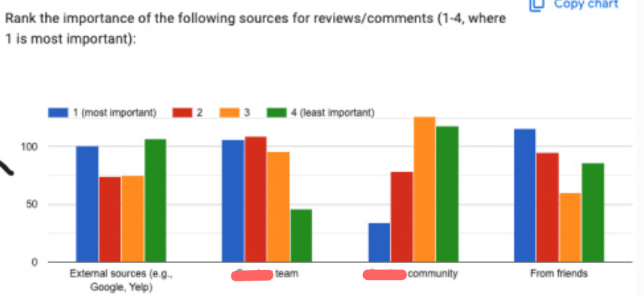
I discovered that people trust recommendations from the startup team to a very high degree, right behind their friends and more than external sources.
I started to get an idea that this product might be something completely different than what we initially thought.
Not only that, but people didn’t really care about the opinion of the broader community. Planned features like the ability to see other people’s albums, save them, or comment on them? Trash. It would just be noise.
At this point, another huge part of the proposition went into the trash. I replaced it mostly with anxiety about whether I was making the right calls.
Key Realization #3: Filtering Is Everything
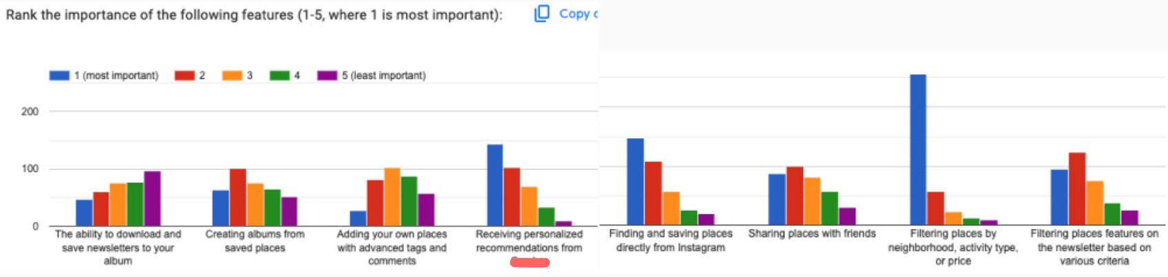
I saw that the most important feature by far was the ability to filter places by various metrics.
This led me to add a new main feature—an entire new journey where people filter places in multiple layers and see the results change in real-time.
This took a huge amount of thinking to get the product logic, design, and backend aligned.
Key Realization #4: Events Are the Secret Weapon
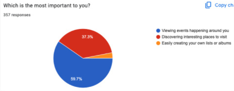
This was the most shocking and surprising finding.
I discovered that what we thought was a minor area in their newsletter was actually the key to everything, especially their huge open rate.
People wanted to stay informed about what fun was happening in their city through trusted sources that have “similar” taste to them.
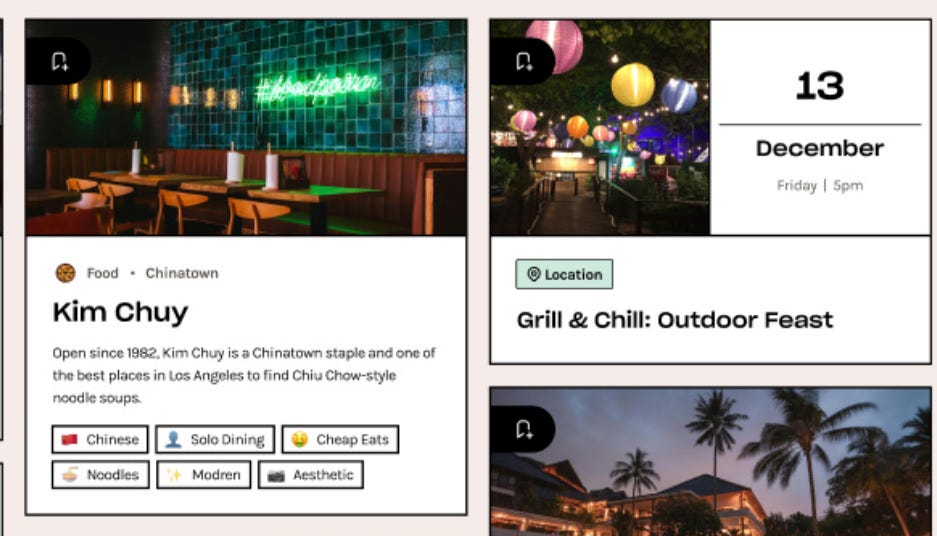
The decision: We split product albums into two visually distinctive types—one for places and one for events. This became a core differentiator.
Key Realization #5: Authority Bias Is the Foundation
This was the final nail in the coffin, where I understood the main benefit and why the previous propositions hadn’t worked—and why mine wouldn’t work either without this insight.
Especially critical given the tight budget for marketing and zero budget for growth.
Authority Bias: The tendency to attribute greater accuracy to the opinion of an authority figure (expert) and be more influenced by that opinion.
The Authority Principle underlies our tendency to obey authority. From a very young age, we are “trained” to obey: our parents, teachers, adults, policemen. As we grow up, we already have an intrinsic classification system that shows us who we are expected to obey—people we consider “superior” in authoritative terms—and who we expect to obey us.
This was the behavioral bias on which the entire proposition should be built. People trusted the newsletter because they inherently trusted the founder, who was making it, and viewed her as an authority on LA recommendations.
Therefore, they placed enormous emphasis on the curation of lists, ensuring it came from that trusted source.
The strategy shift:
We focused on the backend to help the team add places easily, NOT on letting users add places easily.
If they wanted to grow, we needed to focus on an influencer-like authority building strategy. Only someone approved by the company as a trusted ambassador could create new albums in new cities.
If new places wanted to join, they would need company approval.
This would definitely slow down growth. But otherwise, the company would just be another generic recommendation app, and no one would really use it.
This was the end of the entire product discovery phase. Now we could move to design.
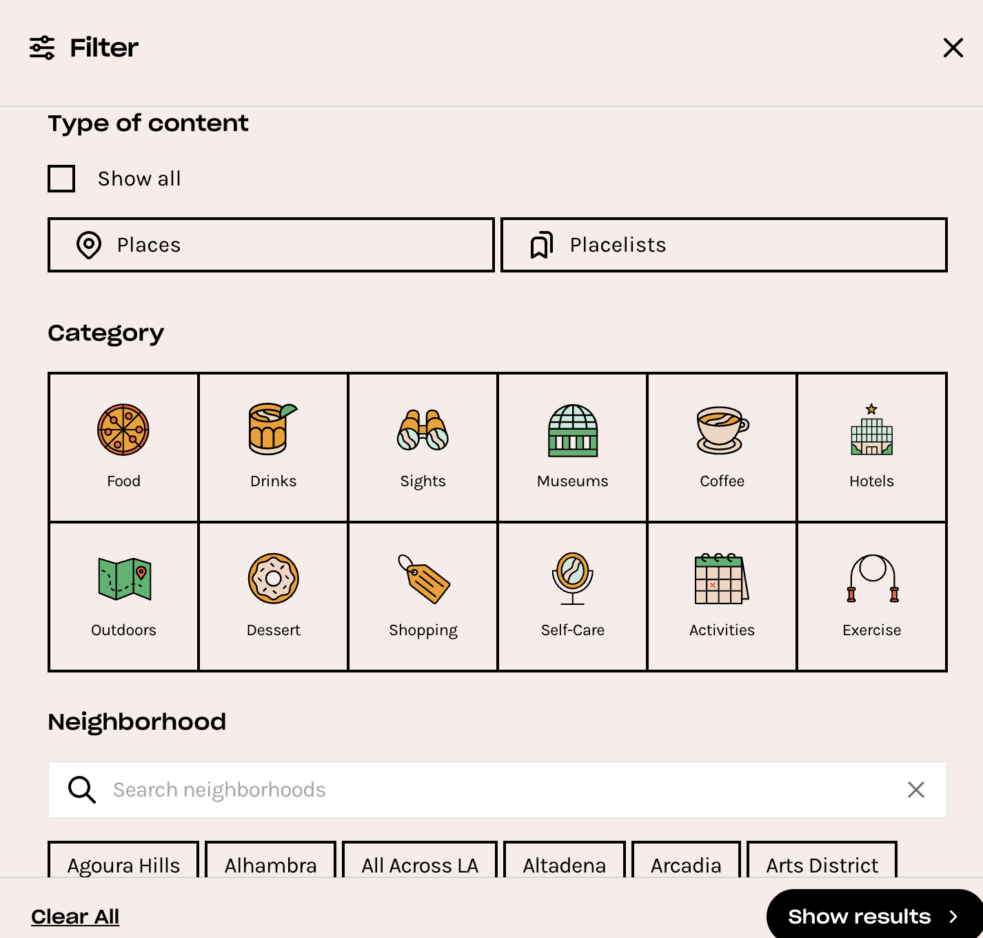
Design
I’m no designer, so this will be brief. But design is one of the key parts of the entire process. It’s like communication—no matter how good the idea is, if you can’t design it properly, it won’t land the same way, and all the effort is wasted.
One interesting challenge I remember was that the product was for everyone, but almost exclusively women were using the newsletter. But we needed both sexes.
Through additional interview questions, I discovered that their boyfriends never wanted to use it because it looked “girly.”
These things matter. Visual identity affects who feels the product is “for them.”
However, if we don’t need to develop something truly unique—which most of the time you don’t, nor is it necessary—what I do is steal like an artist. Basically, I look not only at direct competitors but mostly at other apps where I can reuse their design logic and adjust it to my case.
This is often how innovation happens. You either take something existing and make it better, or you take inspiration from a totally different field and apply it to your context.
Design Inspirations with Behavioral Architecture
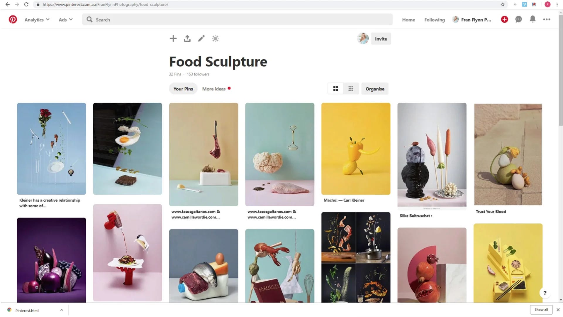
For this project, the entire product was based on three main inspirations: Spotify, Pinterest, and Airbnb.
None of these are recommendation apps. But each solved a behavioral problem we needed to solve.
Inspiration #1: Spotify - Ownership & Curation Identity
The Behavioral Principle:
Spotify’s album and playlist mechanics create ownership and curation identity. Users don’t just consume content—they organize, personalize, and express themselves through collections.
The “save to playlist” function reduces decision fatigue by allowing deferred choice. You can save something now and decide later whether to actually engage with it deeply. This removes the pressure of immediate commitment while maintaining the sense that you’re building something personal.
People value what they curate. Your Spotify playlists feel like extensions of your identity—which is why people get protective about them and share them selectively.
How We Applied It:
The whole main mechanics and logic of our product were based on Spotify’s model. Users could:
Find places and events
Create their own albums (curated collections)
Save existing albums to their library
Build a personal collection over time
We also borrowed some of the visual design language—the card-based layout, the album cover aesthetic, the way content is organized and browsed.
The result: users weren’t just browsing recommendations. They were building their personal LA guide, which created much stronger engagement and retention.
Inspiration #2: Pinterest - Visual Aspiration & Goal-Setting
The Behavioral Principle:
Pinterest’s board system leverages aspiration and visual thinking. Boards transform passive browsing into active goal-setting.
The grid layout creates what’s called the Diderot Effect—one pin triggers desire for related pins, keeping users engaged in a browsing flow. You start looking for one thing and end up saving twenty because each image suggests another possibility.
Pinterest also understood that people think visually about experiences, not just products. You’re not saving “restaurants”—you’re saving “date night ideas” or “weekend brunch spots.” The emotional context matters more than the categorical organization.
How We Applied It:
From Pinterest, I took the visual board design for displaying places.
We used:
Grid-based visual layout for browsing
Image-first presentation (not list-based like Yelp)
Aspiration-focused framing (not just “restaurants” but “perfect date spots”)
The key was making the browsing experience feel inspirational rather than transactional. You weren’t searching for “a place to eat”—you were discovering possibilities for your next LA experience.
Inspiration #3: Airbnb - Bounded Choice & Social Proof
The Behavioral Principle:
Airbnb’s place cards use social proof and scarcity cues brilliantly. Reviews, “rare find” badges, and “only 2 left at this price” create urgency without feeling manipulative.
The card format creates bounded choice architecture—users compare within a digestible set rather than feeling overwhelmed by infinite options. You’re not looking at “all 50,000 properties in Paris.” You’re looking at these 12 highly-rated options that match your filters.
Rich imagery triggers emotional decision-making, not just rational evaluation. The photo makes you imagine yourself there before you’ve read a single detail.
How We Applied It:
For individual place design, I borrowed Airbnb’s card structure.
We used:
High-quality imagery first
Social proof elements (though from the trusted curator, not crowd reviews)
Clear, digestible information architecture
Emotional framing in descriptions
The place cards were designed with a more GenZ aesthetic to match the target audience, but the underlying structure came directly from Airbnb’s psychology.
What We Didn’t Build (Yet)
There are lots of future features missing from this initial version: personalized recommendations based on behavior, social network integration, achievement badges, friend activity feeds.
But the design is prepared for all of them. We created a foundation that could expand without requiring a complete redesign.
The initial version focused exclusively on nailing the core experience: trusted curation delivered through intuitive, visually-driven discovery.
Everything else could wait.
Testing
Design, testing, and even monetization are all part of product discovery, but I’m separating them here to make the process easier to follow.
Because when you create designs, you still need to test them, gather feedback, and iterate back and forth until it’s not just good—it’s right.
With testing, the approach is very individual and you can do it many ways. But usually what I do is jump on a call with users, send them access to the prototype, have them share their screen, and give them specific challenges.
For example: “Add this place to an album,” or “Find a map view for this restaurant,” or “Filter for outdoor seating within 2 miles.”
The goal isn’t to see if they can eventually figure it out. The goal is to see where they hesitate, where they get confused, where the flow breaks.
One of my favorite visualizations for tracking this looks like this:
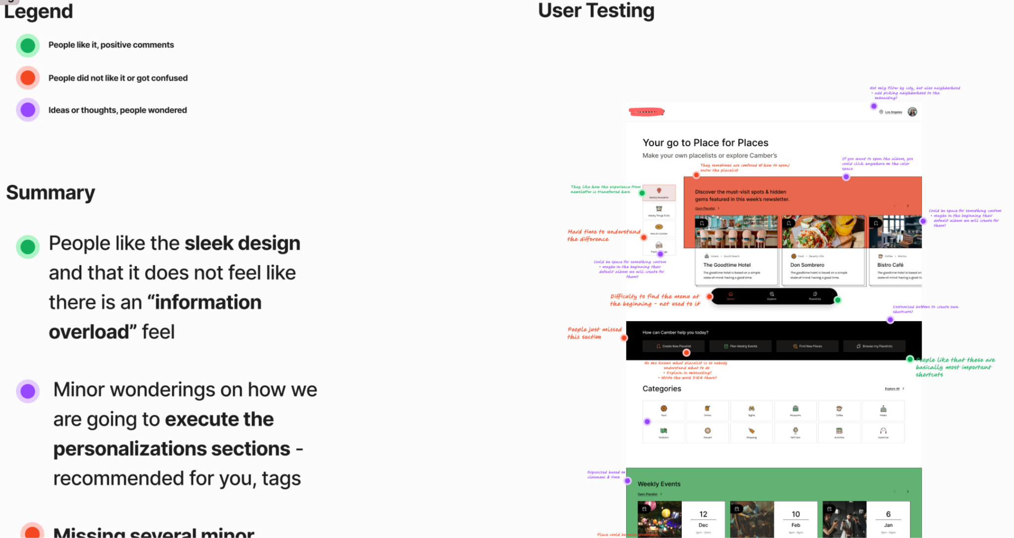
I’m including these “messy” versions because I always wished that when reading case studies, people would show this type of process. The polished final version doesn’t teach you nearly as much as seeing how the thinking actually happened.
Testing across contexts:
You need to test multiple versions in various situations, devices, and user stories:
Different entry points (newsletter link, direct search, social share)
Different devices (mobile primarily, but also tablet and desktop)
Different user states (first-time vs. returning, logged out vs. logged in)
Different use cases (planning ahead vs. spontaneous “I’m here now, what’s nearby?”)
The pattern recognition comes from seeing where the same confusion points appear across different contexts. That’s when you know it’s a real problem, not just one person having a bad moment.
Key testing insights we discovered:
The album save flow was unclear initially. Users weren’t sure if they were saving the whole album or individual places. We made the distinction much more obvious through visual hierarchy and micro-copy.
Filtering needed to be more progressive. Users got overwhelmed when all filter options appeared at once. We changed it to a stepped approach where you select category first, then see relevant filters for that category.
The events vs. places distinction needed to be immediate. Early prototypes didn’t make it clear enough which album type you were looking at. We added color coding and distinct visual styles.
Map view had to be accessible from everywhere. Users kept trying to see “where is this?” without leaving their current flow. We added a persistent map toggle.
None of these insights came from me sitting in a room thinking hard. They came from watching real people try to use the product and get stuck.
That’s the only way to really know if your design works.
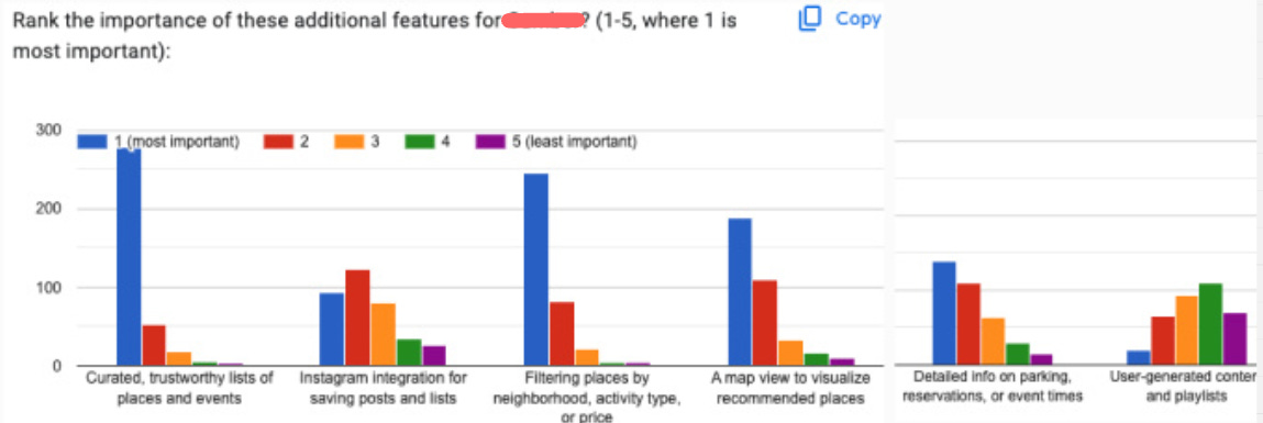
Monetization / Business Model
One of the things that kills most startups isn’t bad product ideas—it’s running out of money before figuring out how to make money.

This section should be part of product discovery from day one, not something you “figure out later” when you have traction.
Plan for the Costs First
One of the most critical things most people skip: creating a basic business model of their expenses.
For those of you who want a great resource, I recommend the Slidebean free startup financial model template.
Or just messaged me, I started my career in M&A and was helping on startup weekends to mentor startups on business models.
For example, many founders want applications where people can add pictures or videos without understanding that storage costs scale brutally. If you grow, you’re going to pay huge money for it—or you’ll need to impose restrictions that can significantly harm your value proposition.
With AI products, this isn’t even a question anymore. Costs scale with usage, period.
For this project, we discovered issues most agencies completely ignore:
The API cost problem: We didn’t know initially that you need to pay for almost every API call if you want to pull any information—street address, phone number, and especially expensive things like opening hours. Every time someone opens a map view on a third-party device, they’re charging you.
We spent a huge amount of time figuring out how to still provide a good experience while imposing restrictions, because this alone could bankrupt the business if we weren’t careful.
The Google compliance issue: Other agencies had ignored this. If the client had grown without addressing it, Google would have shut them down. They take this stuff seriously, especially in California.
The lesson: Create a basic business model with all the expenses mapped out. Especially for any third-party services, APIs, storage, compute, or features that have variable costs.
Know your cost structure before you build the product, not after.
Have a Monetization Plan from the Beginning
Too many startups have no clear idea how they’ll monetize. Ideas like “we’ll sell the data” or “we’ll figure it out as we grow” only work for unicorn-level startups with great funding and product-market fit.
It doesn’t have to be anything major at launch. But if you think about it from the beginning, you can find creative ways to monetize without going straight to generic ads or subscriptions.
Or if you do use ads, at least find non-invasive implementations.
Non-Invasive Monetization Examples
For this project, we identified several monetization approaches that wouldn’t destroy the user experience:
1. Introductory placements
The placeholder that looks like an introduction to the app can be monetized. Places can pay to be featured in that introduction carousel.
From a behavioral perspective: users expect some curated highlights when they first open the app. Making these paid placements (but still curated by the team to maintain quality) doesn’t feel manipulative—it feels like featured recommendations.
2. Album highlighting
Inside the Pinterest-style boards, places can pay to be highlighted or positioned at the beginning of an album.
The key: they still need to qualify for the album based on the curator’s standards. This isn’t “pay to get in”—it’s “pay for better visibility within albums you already belong in.”
3. Curator partnerships
Businesses can pay the founders to visit their location and create content about it—essentially, influencer marketing integrated into the product.
This works because the founder’s authority is the core value proposition. Her recommendation has weight. Businesses understand this and will pay for authentic coverage.
4. In-place vouchers
Each place has the option to add a voucher that users can redeem. This is personalized to the venue and creates a direct value exchange: the place gets foot traffic, users get discounts, and the platform takes a small percentage.
This also creates a behavioral hook—users check the app before going out to see if there are vouchers available, increasing usage frequency.
Why This Approach Works
None of these monetization methods is invasive. They don’t interrupt the user experience. They don’t plaster ads everywhere. They don’t require a subscription that might deter early adoption.
Instead, they leverage the existing value proposition:
Curated recommendations (monetize the curation)
Authority of the founder (monetize the authority)
Discovery experience (monetize the discovery)
The monetization is embedded in the product logic, not bolted on top of it.
A few well-designed revenue streams like these make the difference between a product that can sustain its own growth and one that constantly needs more funding to survive.
This was the end of the product discovery phase. Everything else—development, launch, iteration—would build on this foundation.
Conclusion
This project taught great lessons about building products from constraints.
When you have unlimited resources, you can brute-force your way past problems. You can hire more people, run more ads, build more features, and in many cases, it lets you ignore fundamental problems.

But when you’re constrained—limited budget, tight timeline, previous failures—you’re forced to actually understand what matters.
That’s where real product work happens.
The Framework: Constraints-Driven Product Discovery
If you’re building a digital product or trying to fix one that’s broken, here’s the systematic approach that worked for this project:
1. Map Your Constraints as Advantages
Don’t treat constraints as obstacles to work around. Treat them as clarity-forcing mechanisms.
For every constraint, ask:
What does this constraint force us to prioritize?
What does this constraint prevent us from wasting time on?
What unique advantage does this constraint create?
Limited budget forced us to think about monetization from day one. Client inexperience meant we had to communicate visually. Previous failures gave us proof of what not to build.
2. Investigate Before You Ideate
Most teams jump straight into brainstorming features. That’s backwards.
If product-market fit already exists somewhere (even in a different format like a newsletter or competitor), switch into investigative mode:
What’s working that we can’t see yet?
What behavioral patterns are we missing?
What underlying principles are driving engagement?
The 80% newsletter open rate was the signal. Authority Bias was the underlying principle. That insight shaped everything.
3. Research Until You Find the Insight That Breaks Your Assumptions
We didn’t stop researching when we had a decent hypothesis. We kept going until we found insights that contradicted our assumptions.
We thought social features would drive engagement. Wrong.
We thought user-generated content would create value. Wrong.
We thought easy place-adding was essential. Wrong.
If your research only confirms what you already believed, you haven’t researched enough.
4. Steal Behavioral Patterns, Not Visual Design
When looking for inspiration, don’t copy competitors. Find products that solve similar behavioral problems in different contexts.
We borrowed:
Ownership mechanics from Spotify (music curation)
Visual aspiration from Pinterest (idea boards)
Bounded choice architecture from Airbnb (property search)
None of them are recommendation apps. All of them solved problems we needed to solve.
5. Test with Real Behavior, Not Opinions
Don’t ask users what they want. Watch what they actually do.
The album save confusion, the filter overwhelm, the events vs. places distinction—none of these came from survey questions. They came from watching people try to complete tasks and get stuck.
6. Design Monetization into the Product, Not onto It
Monetization shouldn’t feel like an afterthought or an intrusion. It should leverage the core value proposition.
Our monetization worked because:
Featured placements reinforced curation (the main value)
Curator partnerships monetized authority (the key differentiator)
In-place vouchers increased usage frequency (behavioral benefit)
Revenue becomes sustainable when it’s designed into the product logic, not bolted on later.
When This Approach Works Best
This constraints-driven methodology works particularly well when:
You’re building with limited resources (budget, time, team)
Product-market fit exists in another format (newsletter, offline service, manual process)
Previous attempts have failed (you have proof of what doesn’t work)
Trust and authority matter more than features (fintech, healthtech, local services)
You need sustainable growth without massive marketing spend
It doesn’t work as well when you’re exploring completely new territory with no existing validation. Then you need a different approach.
The Messy Reality
I’m showing you the polished version of this process, but the reality was messier.
There were moments where I questioned whether scrapping 30% of the MVP was the right call. Times when the client looked at me like I was insane for killing features they thought were essential. Nights when I wasn’t sure if the Authority Bias insight would actually translate into product success.
Product discovery isn’t clean. It’s not linear. It’s making decisions with incomplete information and hoping your behavioral understanding is correct.
But that’s also what makes it valuable. Anyone can follow a playbook when the path is clear. The real work is building the path while you’re walking it.
What Happened Next
The product launched. The core proposition—curated recommendations from a trusted authority, delivered through intuitive visual discovery—worked.
But this case study isn’t about celebrating a successful launch. It’s about showing you the systematic process that got us there despite the constraints, the failures, and the uncertainty.
If you’re building something similar, you don’t need more money, more time, or more features.
You need clarity about what actually matters. Constraints and behavioral insights, properly understood, force that clarity better than anything else.
— Peter
Wow, 'before writting code' is so true. What if everyone adopted that?